Mario Nailed Web Design (Kinda)
No, I’ve not eaten too many shrooms. As I was playing Super Mario Maker it struck me how many aspects of Mario’s design actually compares to modern web design. Miyamoto and his team had to solve several fundamentals of digital interactions; long before the web existed as we know it today. It turns out most of their ideas still hold up pretty well and there’s a lot to learn from it.
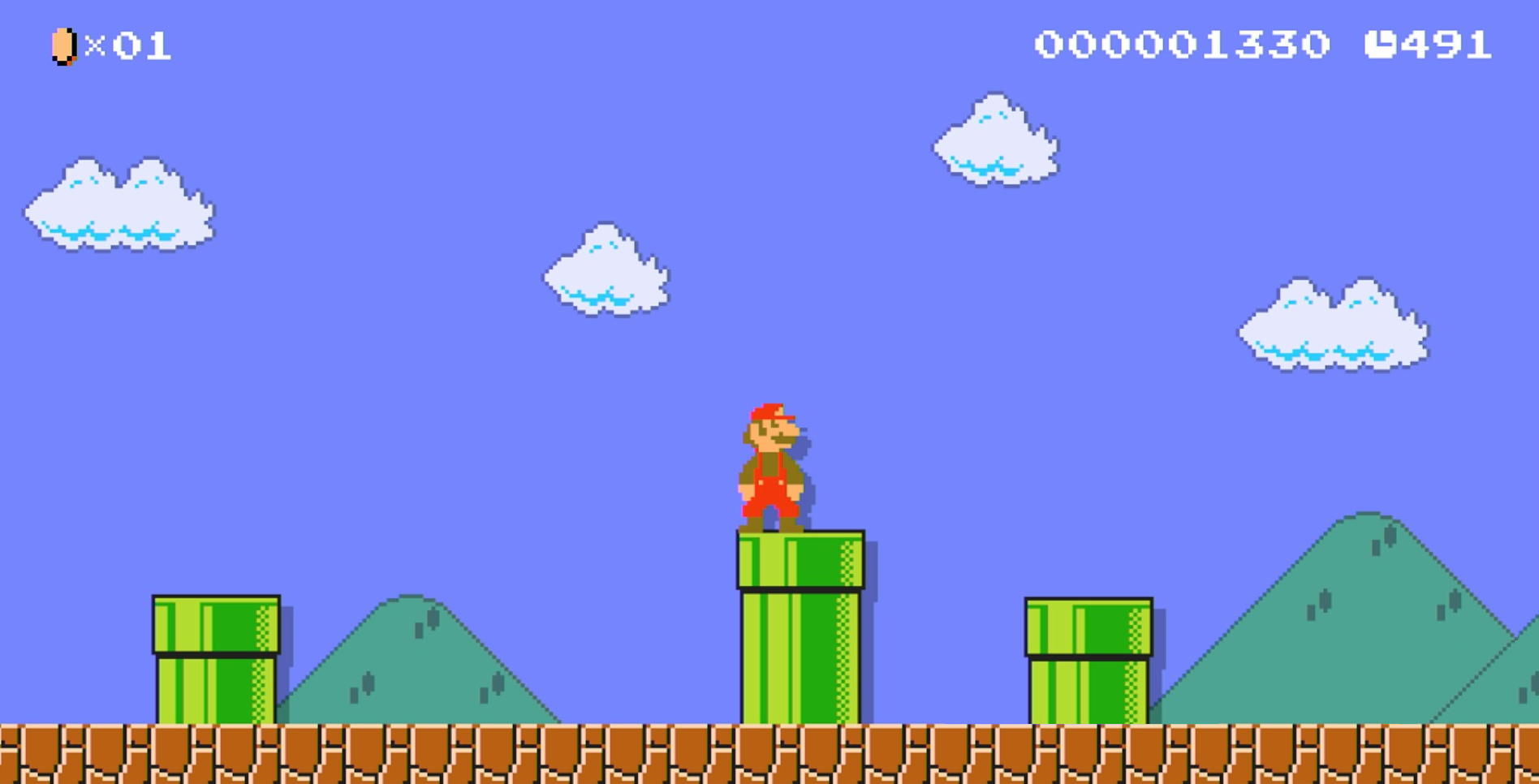
Stick to the point
The level design of Super Mario Bros has been analyzed to death as it’s still among the best. Partly due to technical constraints every asset had to be thoughtfully placed resulting in a minimalistic approach to the entire design. Unlike other games at the time, Super Mario Bros kept the screen deliberately uncluttered. If you’d take a screenshot every second of the game, every screenshot would contain just a few clear concepts, never more. This kept the players focused at the task at hand and prevents them from getting distracted with non-vital information. This is definitively an area we could learn more from when it comes to modern web design.
To be able to achieve this level of focus, Super Mario Bros relied heavily on scrolling. Super Mario Bros wasn’t the first side-scrolling platformer but it helped popularize the genre. The game’s popularity should be proof enough that the concept of scrolling was easy enough to understand already back then, but as a designer I still have to explain that "the fold" is a myth. Today, there’s substantial proof that scrolling is second nature to the general user. Check out Luke Wroblewski’s excellent article about the subject.
You don’t need onboarding screens
The Mario games are an excellent example that it's possible to explain design mechanics without long tutorials. In the Mario games the onboarding is happening as the player progresses. Starting off with easy interactions and then gradually ramp up the complexity. Below is a video that breaks down of how Mario explains different concepts without text based tutorials:
Smooth animations is worth it
“Arcade Quality” games run at a solid 50–60hz. Mario also opted for a solid 60 fps for it’s scrolling as it keeps the players orientated. This is something that we continue to struggle with in modern web design as we often prioritize cool effects over performance. Sure, you could argue that we are pushing much more complex graphics for bigger screens. But if Nintendo could achieve butter smooth scrolling on a measly NES; we can do it too.
Learn more about web design and frame rate over at: Jankfree or check the video below for a quick explanation of the benefits with 60 fps:
Design at 100% zoom
Mario Maker presents its user created levels by providing a zoomed out overview. Appealing overviews doesn’t necessarily reflect the quality of the level. At their actual sizes, the levels are perceived entirely different. As a web designer I often tend to design my sites slightly zoomed out to get a better overview. I'll definitively try to break that habit going forward. Viewing a webpage in its original size gives a different perspective of the entire design.
Conclusion
While Mario or game design isn't the same as web design it's funny to think that we've struggled with these issues while Mario has been among us the whole time. Can we find inspiration from other successful principles from other games and apply it to the web?