Envisioning the Perfect Design App
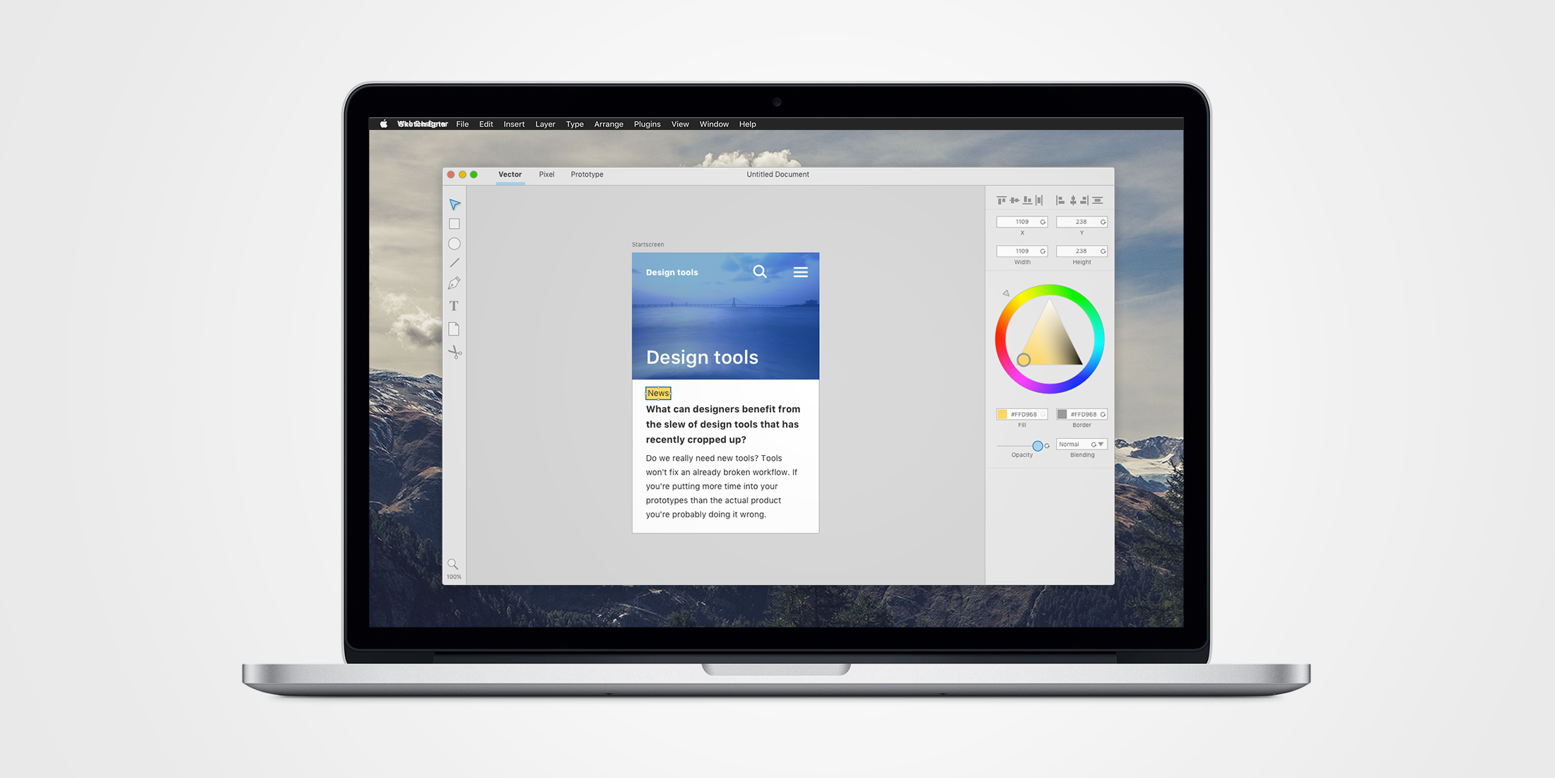
Tons of new web design applications have cropped up recently, but what new features actually enhances productivity? In this article we’ll explore what features we could expect to see more of in future design applications and why they matters.
To understand what new features could enhance productivity, we need to define the main purpose of design mockups. A question that often pops up when discussing new applications is whatever we really need them. Wouldn’t good old Photoshop suffice? Yes, probably.
New tools won’t make your designs better and they won’t fix your broken workflow. It doesn’t matter how well your design mockups are kerned if that kerning doesn’t end up in the end-users browsers. High level prototypes won’t ease the production more than good communication or detailed spec-sheets. If we are going to spend hours on higher level prototypes it better benefit the end project by offering more than static design sketches, communication, spec-sheets and live coding can do today. New design applications need to offer a way to iterate design ideas much quicker and more freely than what’s possible with code to make the entire process worth it.
What better applications can do
Design has always been constrained to the proportions of its canvas, but with responsive design we’re dealing with something entirely new. While front end developers have an updated set of tools for these new conditions, there simply hasn’t been any similar alternatives for visual designers. This creates a large gap between the designer produced mockups and the real world applications. It has been argued that this gap is what’s causing our responsive designs to become homogenized. The gap has also sparked a lot of discussions whatever designers should just get over it and learn to code. While it’s always a benefit to understand how the applications actually work; the primary responsibility of a designer should always be to put the end users first. Code shouldn’t need to occupy the designers attention more than necessary. Tools that better reflect the end result not only gives a better understanding of the medium but also quickly gives us an idea of the implications a given solution has under different circumstances.
There are several refreshing ideas in many of the recent design applications, but how do you judge whatever a new application will prove itself useful and worth learning? Successful new apps such as Sketch proves that productivity is an important factor while inVision proves that bridging the gap between interaction and design could be a winning formula. In just the past year the offering has exploded and competition is getting really though. Most new apps offer a couple of unique features. The problem is that a lot of the apps have a hard time synchronizing with the other apps already in your workflow, which results in a lot of manual setup. For new apps to really compete with the big ones they have to either present a suite of useful features that makes the initial setup worth it or provide easy methods for synchronization between other apps. This is probably one of the reasons why Project Comet has gained so much attention as it seemingly handles several interesting features at once.
So what features would be in the ultimate-killer-of-all-design-apps? I’ve putted together a list of the most promising features that we’ve seen in recent web design apps. All of the features chosen solves some of the productivity gaps that exists today compared to code.
Vector tools and artboards
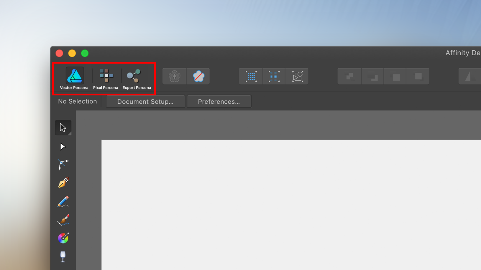
Since the web is vector based your design has to work with vector shapes. Sketch has managed to attract a strong user base by providing a vector based toolset focused on web design. Vector tools also have the benefit of allowing adjustable or even programmable shapes. But there are times where good old pixels just can’t be replaced. Put simply, no design workflow is complete without access to a complementary bitmap-editor. Affinity Designer manages to seamlessly combine a vector based tool with a bitmap-editor by providing different context settings. Depending on context the available tools changes and the app behaves differently which allows for an uncluttered workspace for every scenario. A perfect web design application would either provide seamless integration to a bitmap-editor, or in best case: the app would provide both types of editors inside the same application just like Affinity Designer.
Interactivity
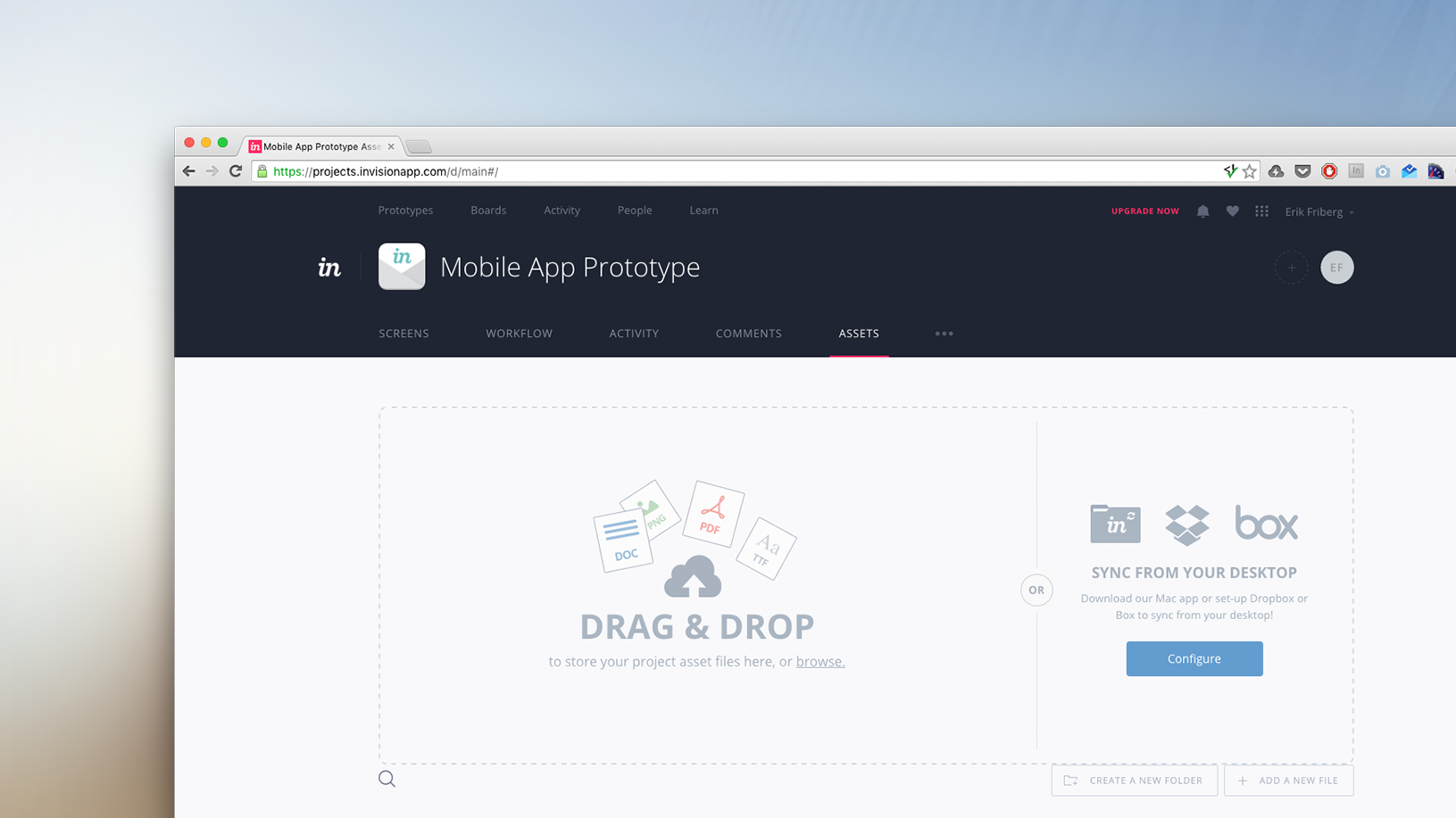
Prototyping tools lets us build reusable prototypes for user testing. Simple prototypes lets us validate the intended structure and user flow early on and remove bumps before they even get implemented. InVision has become one of the strongest competitors in this category. Thanks to its syncing capabilities; creating prototypes in InVision is pretty straight forward. But there’s still room for improvement here; the better our design applications are integrated with our prototyping tools the less rework will ultimately be necessary. The perfect design app would instantly reflect design updates in our prototypes, to allow for quicker iterations.
Animations and transitions
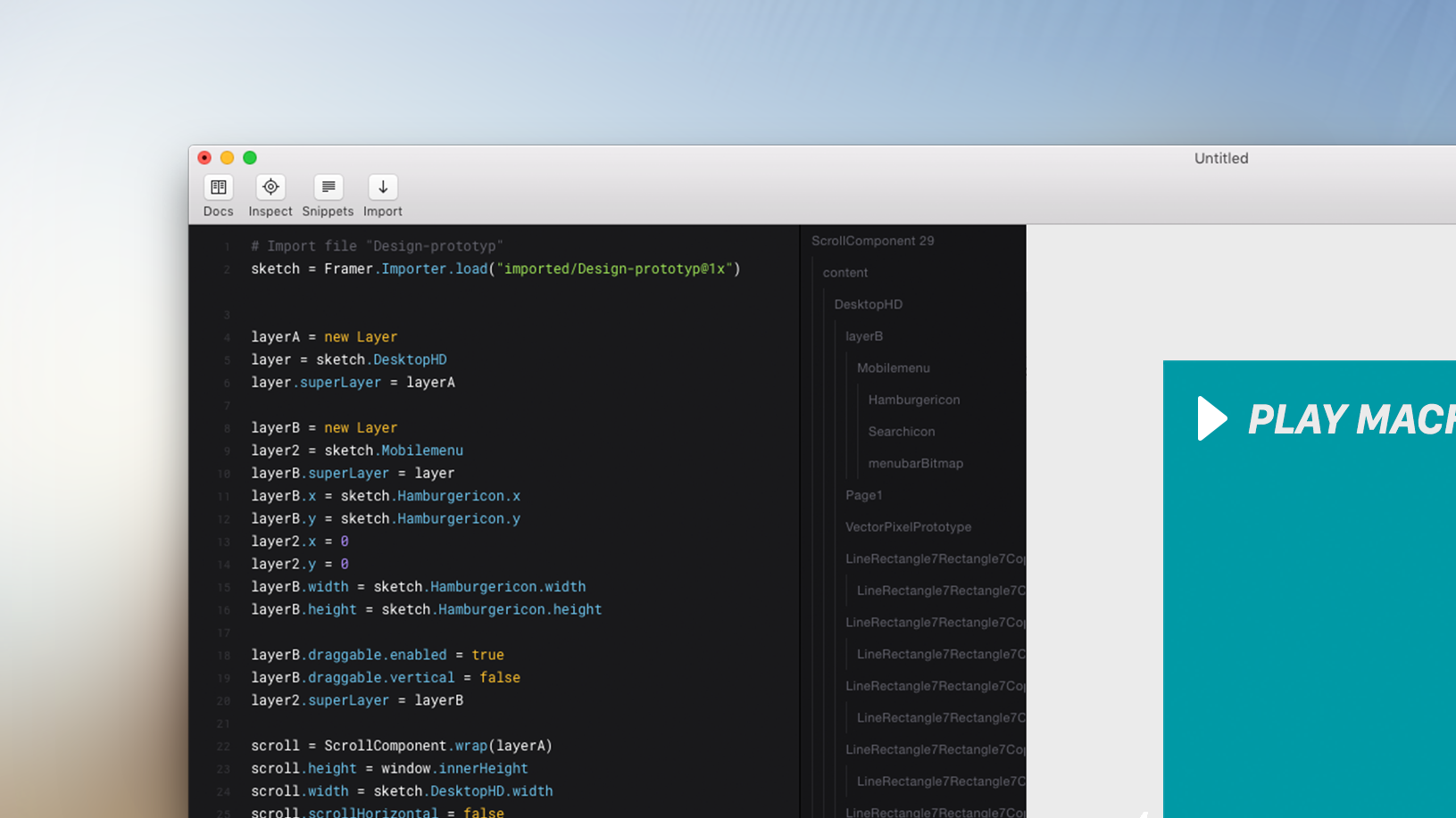
To enable more designers to design compelling animations our tools need a workflow that lets us quickly set up our vector shapes for animation. Most of todays professional animation tools needs every component to be reassembled before animation is possible which greatly limits the flexibility. Integrating an animation workflow into our design applications should in theory let us test animations with the already existing vector shapes. Tools such as Framer lets us access every object in our design mockups directly and apply animations to them non destructively. Our perfect app would probably provide animation tools directly inside the app, sidestepping the problem altogether.
Object Oriented Components
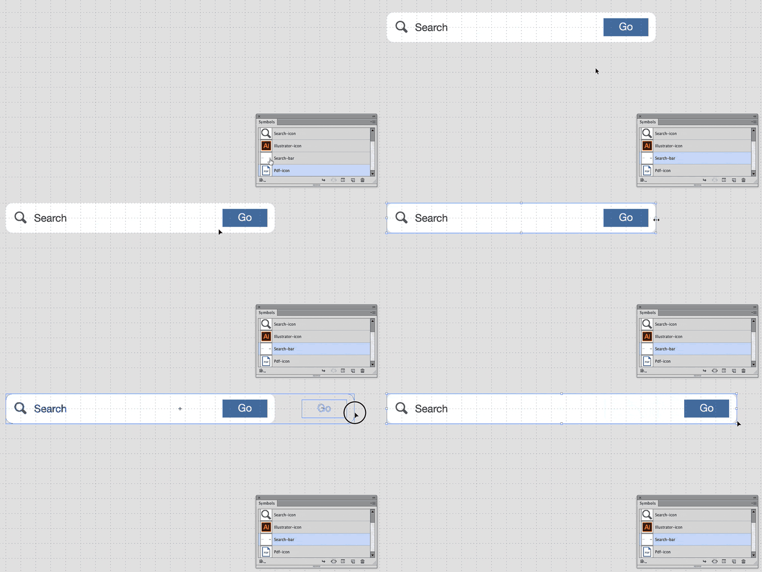
In Web design it's common to build designs around constructions of repeating components and shapes with variable content. A common example of this are cards. Cards are relatively easy to manage in CSS but they are unnecessarily cumbersome in design applications. Some design applications lets designers create symbols of components that mirrors the properties of a reference object. But most of those implementations also fails to let the user define what parts should mirror the original construction and what parts should be variable. Illustrator, Flash and good old Fireworks have capabilities for reusable symbols that also allows certain areas of the symbol to remain static during resize.
The perfect design app would hopefully allow for per property syncing, allowing everything to be adjusted while still inheriting selected features from the parent object.
Reflow
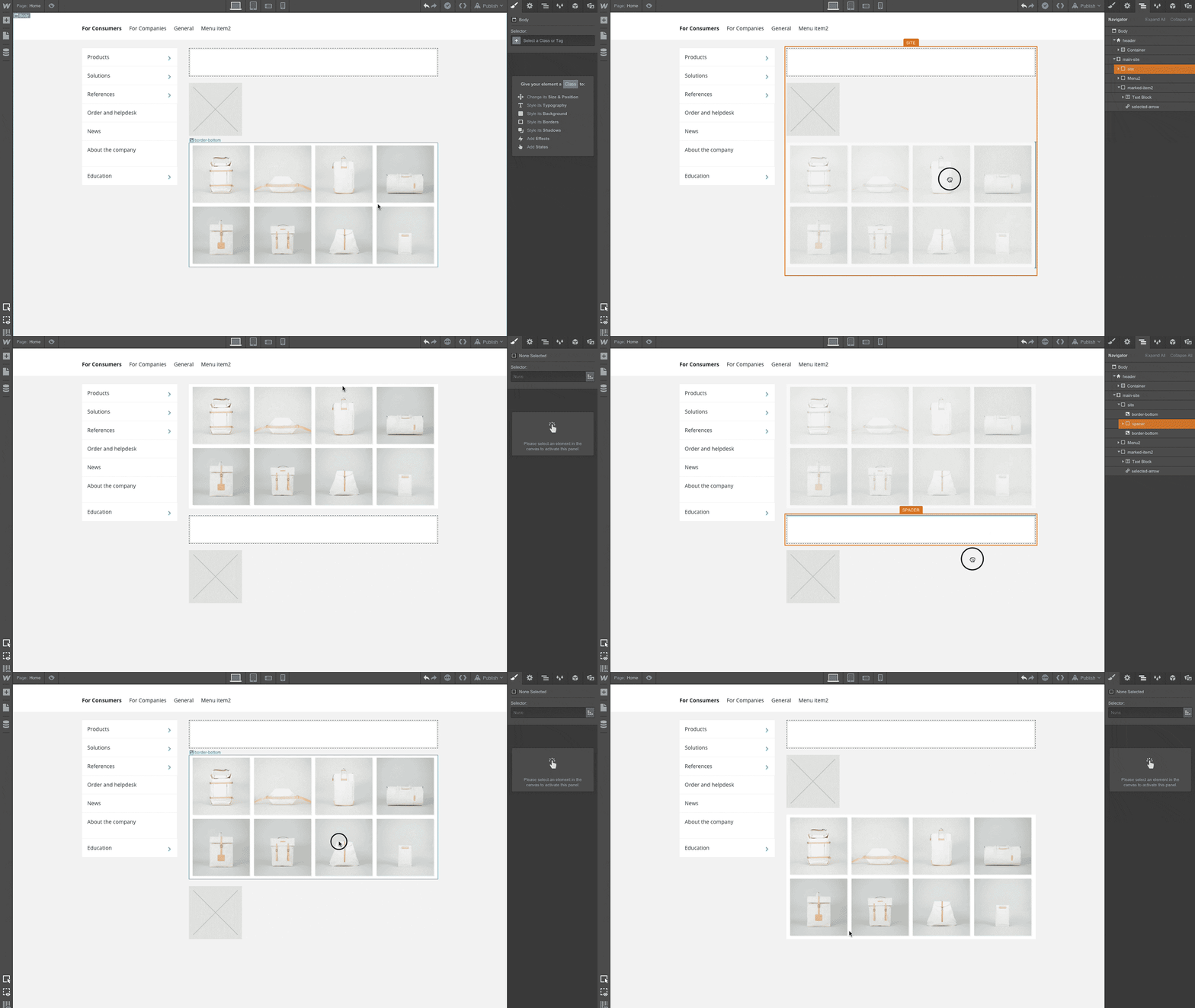
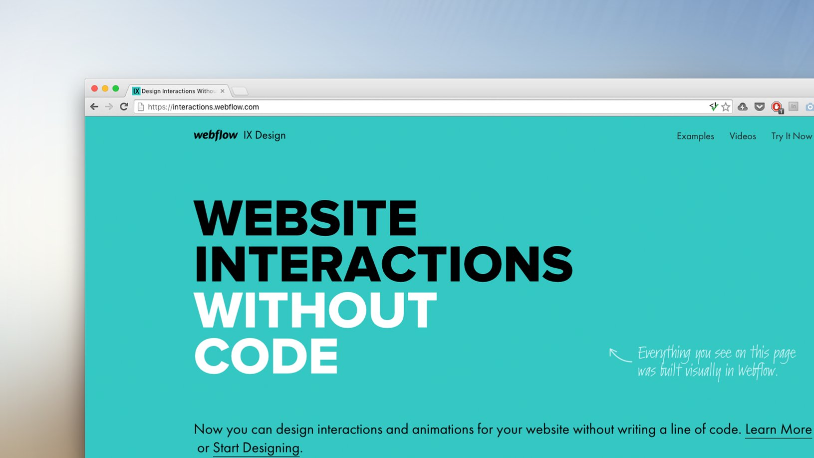
If a designer would like to switch place of two components things gets messy quickly. In HTML this is easy as pie but design applications require designers to manually readjust the entire layout. Automatic reflows isn’t easy to implement since it’s hard to programatically judge what element should go where. But pure HTML/CSS solutions such as Webflow handles reflows elegantly. Conventional vector applications could definitively improve the current workflow by adding support for less automatic variations of reflow. A possible solution could be to let users cut out a part of the artboard/canvas and insert the piece anywhere. Such a solution would make it easier to reorder entire sections without needing to realign every element beneath it.
Our fictive design application would have solved this and automagically reflow all our content correctly of course ;-)
Responsive layout
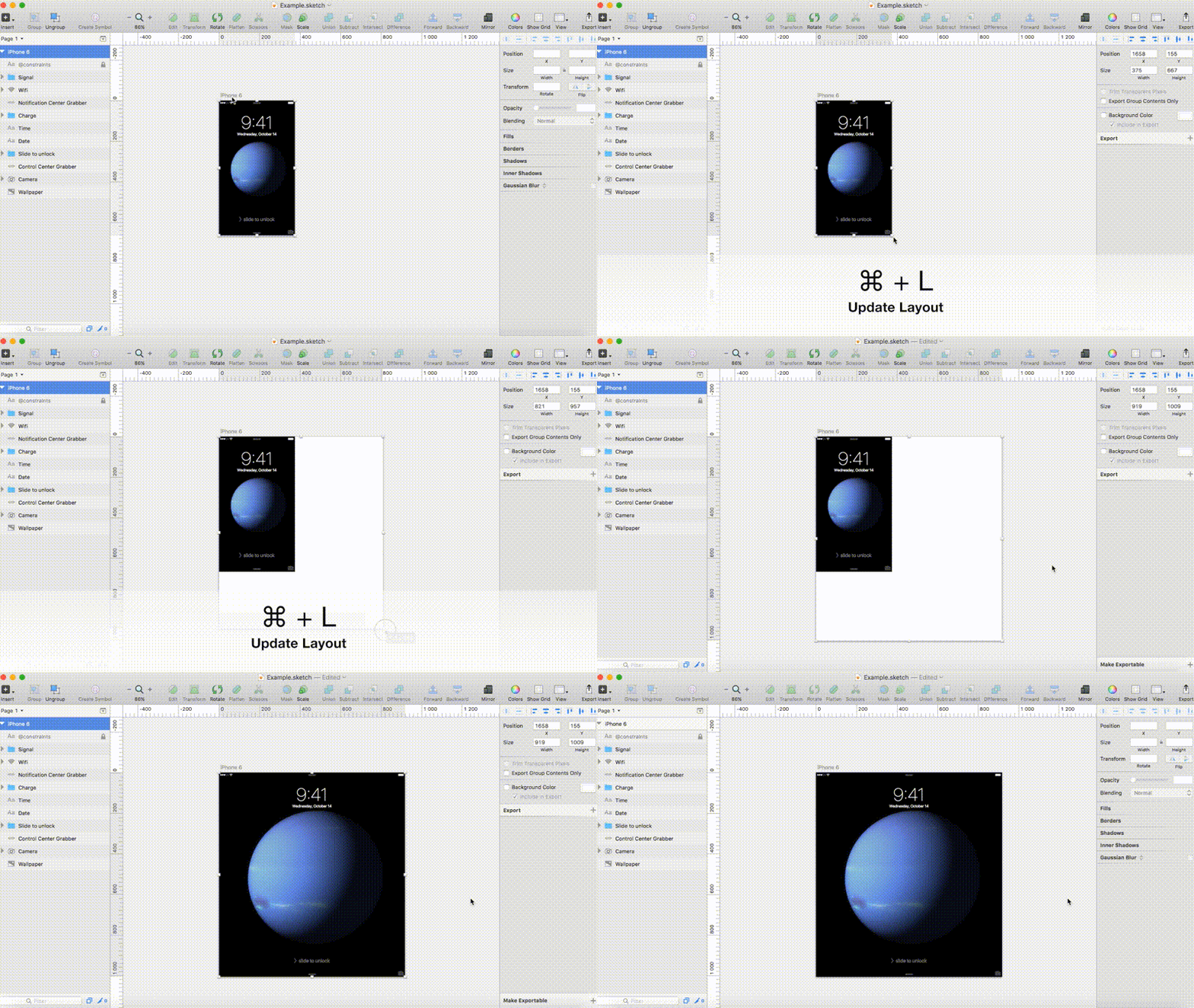
A responsive module look different depending on the available screen size. There are several ways our tools could ease our workflow for experimenting with responsive layouts. One of the most basic implementations is to let objects snap to a defined corner of its parent container. Another implementation would be to help designers manage different versions of the same designs depending on artboard settings. The same set of components/symbols or paragraph styles could have different modifiers when mobile mode is enabled etc. Sketch has several plugins that experiment with corner constraints and the now defunct Edge Reflow was a great example of what we can expect from the future of design applications. It’s definitively worth keeping an eye on Figma here, as they have implemented a similar feature natively into their tool.
Better versioning and collaboration
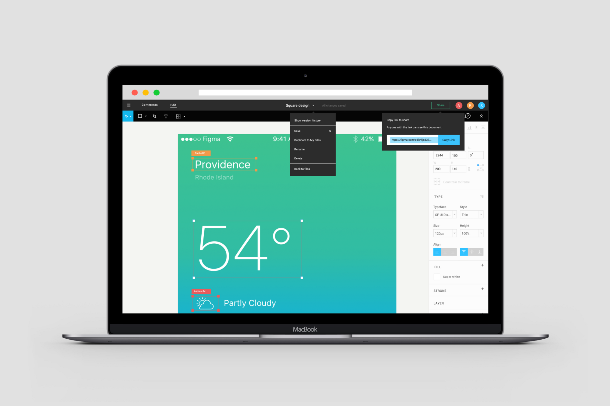
This is something that’s been plaguing design applications since the beginning. If you want to work in a bigger design team with shared assets there’s very few options. Every file needs to be synced to another computer for others to participate and if someone jumps in while someone else is working we end up with conflicting copies. Furthermore few applications lets us save and review older versions of our designs. If we’ve had chosen to work directly in code we could easily handle all this with Git. Is it time for design tools to adopt a few cues from Google Docs or switch to a file format that can support versioning such as SVG? Figma is one of few applications that tries to tackle this issue. The perfect web design app would definitively take a hint from Figma.
Specifications
The dream among design applications is of course to be able to design and publish production ready code directly from the application. However, it’s proven to be much harder to create in practice than we might have thought. Automatically generated code can’t simply replace handwritten counterparts. But there are applications out there that are indeed getting better and better at this. Webflow is the application that’s closest to that dream of production ready exports. In the meantime applications that can export usable CSS snippets or compile a specification sheet for developers will be highly beneficial.
Would the perfect design application also replace web developers? Maybe. But Dreamweaver proved early on that apps always have a tendency to be a few steps back in terms of features compared to whats actually available on the web. To provide the most up to date experience, the perfect web design app should prioritize a flexible environment for designers rather than fully functioning exports. In the future I wouldn’t be surprised if web design apps are powerful enough to export fully functioning sites though, and Webflow might just be closer to that future than we might think.
Conclusion
There’s even more ways to innovate design applications, but these are some examples where new features could help us bridge the gap between static mockups and actual code. For design mockups and prototypes to continue to be a relevant step in web development we need tools that enables us to do our work and focus less on the stuff that already comes automatically for the developers. Sure, with coding knowledge we can intentionally leave out stuff from our design sketches. But then we also lose the ability to judge our designs properly before implementation.