Illustrator for web design part 2
In an earlier article we explained some of the huge benefits that comes with using Illustrator over Photoshop. But Illustrator, like Photoshop, isn’t built for web design and some "features" make the program dreadful to use.
The problem with illustrator
Illustrator could be a definitive choice for working with web design but it does come with a few weird quirks. Thankfully, most of the stuff is easily configured before jumping into production.
Switch to RGB
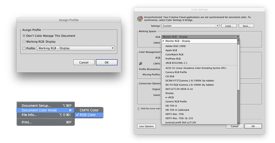
Right off the bat, switch your color space for monitor work, it appears global colors in Illustrator can generate unexpected results when working with RGB color profiles. For web design I’d suggest to switch off color management all together. Start off by switching to RGB if you haven’t already done so. Go to File/Document Color Mode/RGB color to switch color mode to RGB. Now go to Edit/Color Settings/ and switch working spaces to Monitor RGB - Display, close and go to Edit/Assign Profile... and select Don’t Color Manage This Document. Done!
Align to pixel grid
While align to the pixel grid is a great idea to prevent blurred edges; it doesn’t work as you’d expect in Illustrator. If you draw a shape containing an odd numbered stroke Illustrator will “help” you by placing your shape in-between two pixels, and you can’t fix it until you either remove the stroke, align it to the inside, or turn off the align to pixel grid option all together. Illustrators take on the pixel grid just isn’t meant for the web.
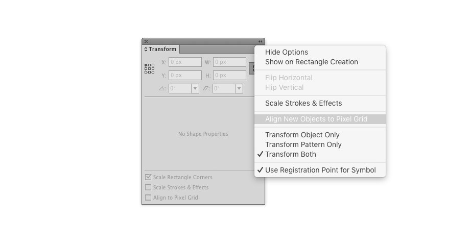
To turn off align to pixel grid: Deselect any shape, go to Window/Transform/ click on the “more options” button in the transform panel and uncheck the “align new objects to pixel grid”-button. For all shapes already drawn while the option was turned on you’ll need to manually uncheck the “align to pixel grid” checkbox in the transform panel for every object that was created with it.
Snapping to grid
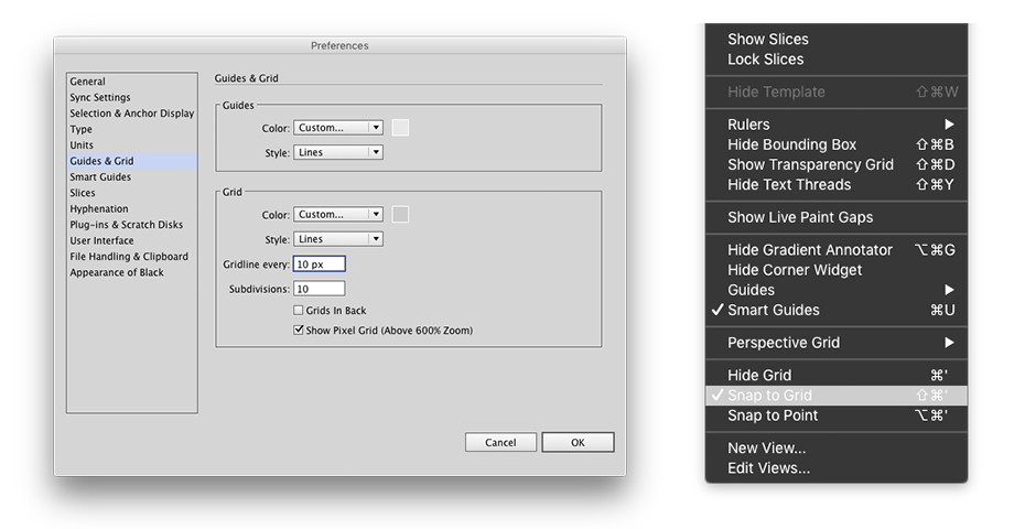
With the “align to pixel grid” option turned off we now face a new problem. Illustrator is a vector program and it isn’t created with pixels in mind, therefore; all our objects can be drawn in-between pixels. This obviously isn’t ideal when creating web design. To solve this first go to Illustrator/Preferences/Units and choose pixels. Then go to Illustrator/Preferences/Guides & Grids/ and set Gridlines to 10px and subdivisions to 10 (that will equal one pixel). Now, go to Window/ and turn off snap to point, and turn on Snap to Grid. Your shapes will now snap to full pixels as you draw them!
Keyboard increments
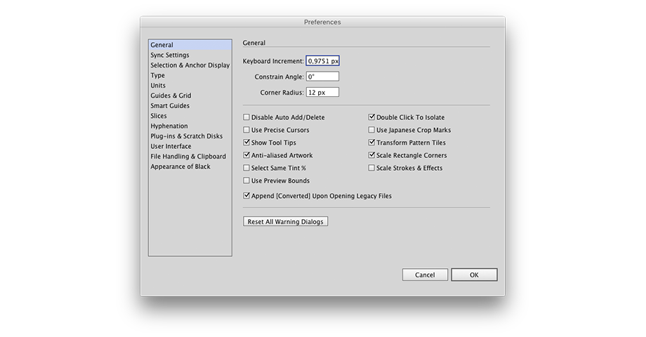
We've almost configured our grid, just set the keyboard increments in Preferences/General to 1px and we should do alright, however, you’ll notice that manually moving objects with the keyboard arrows might result in a 2px jump instead of the desired 1px when used in combination with your custom pixel grid. Furthermore, holding shift should result in a 10px jump but sometimes gives you 11px. This is probably because Illustrator doesn’t natively work with pixels and always converts your number in order to process it. This leads your 1px keyboard increment into something more along the lines of 1,0001px, and that value can easily turn into a 2px since Illustrator rounds the new value up or down in order to ensure snapping always ends up on a new grid line. The solution is simply to set the Keyboard Increments setting a bit off like 0,99px for example; our pixel grid will then round it to full pixels. (arrived at this solution after a huge amount of testing, and so far it's been working every time)
New symbol alignment
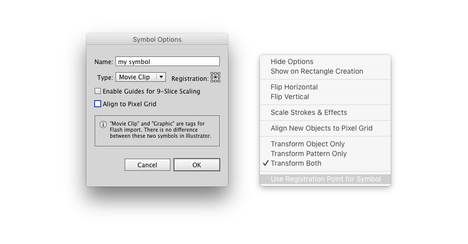
Adding a shape to the symbols library causes it to loose alignment to the pixel grid. To ensure that the shape stays on the pixel grid uncheck the “use registration point for symbol” option under the Transform panel before creating the symbol. Also, in the symbol creation dialog, make sure to uncheck the box “align to pixel grid”.
Cumbersome gridding
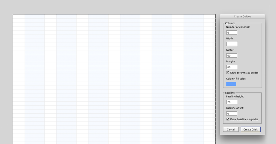
We've set up the pixel grid and it works perfectly, all we need now is to start designing! One of the first things I usually do is setting up a layout grid to work with. It is indeed much easier to create grids manually in Illustrator compared to Photoshop, but the grid plugins available for Photoshop is far more user friendly than Illustrators “make grid”-option. Too bad there aren't any similar grid plugins for Illustrator. Or are there? I decided to make one myself, after all that setup I didn't want to throw in the towel for such a small bump!
All set up!
When you've finally configured Illustrator to behave the way to want it, it's smart to save all your custom settings as a template. If you then place it in the programs template folder you can quickly start a new web project without needing to set anything up again even if you switch and do a print project in between!
If you are interested in learning more about Illustrator for Web Design, definitively check out Matt Griffin’s upcoming AIUX courses!
Design is not about programs, but programs can absolutely make us much more productive; the right program can even make us more willing to experiment. At the moment, Illustrator is actually the most reliable tool for web design as its stable and entirely vector based. But there is some relearning to do, and it might just be more sensible to wait for programs like Sketch to fully mature. It's up to you!