The complexities of global web fonts
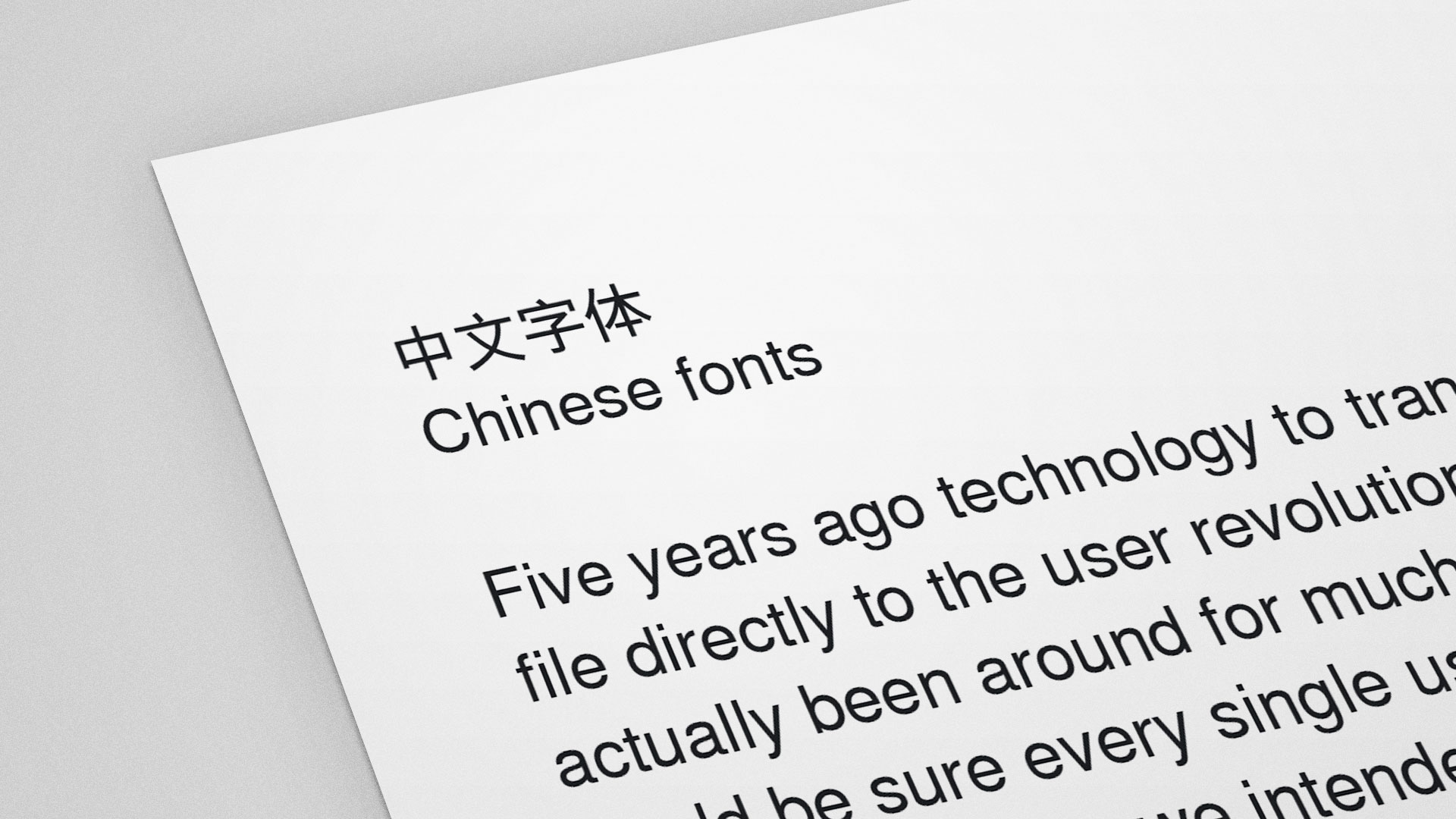
While we almost take web fonts for granted today; it wasn't too long ago since western languages were restricted to just a few selected typefaces. However, it’s fairly unknown that web fonts still presents a huge challenge and is still largely unused for webpages targeting some of our biggest languages. If we really believe in type as a carrier for the message, web fonts has to become more easily accessible everywhere.
Before the @font-face attribute got adopted by all of the major browsers there were no good way to make sure our visitors’s computers would be able to render our web designs with the typeface we had intended. In worst case, the typeface displayed on the users’s computers looked nothing like the typeface we’ve designed for. To make sure all our users would get the right experience; we were forced to chose between typefaces that came preinstalled on most operating systems. Different operating systems came with different preinstalled fonts, so whatever we chose, we also had to have a backup typeface. Since good design and structure is dependent on typographic widths; we just couldn’t make sure all our visitors would experience our website as we really intended it.
With the resurrection of the @font-face attribute about seven years ago, the ability to transfer our desired font file directly to the user revolutionized the web. This way, we could be sure every single user would experience our website the way we intended to. Finally we could approach web design as any other form of design and the actual content, the text, could be placed front and center without problem. Transferring fonts to the user isn’t a hard task either, since most complete sets of typefaces aren’t larger than your typical image and would only have to be sent to the user once.
The catch
Everything isn’t that easy thought. As of now (2015), it is still technically complicated to provide web fonts for CJK-languages (primarily Japanese and Chinese) because of their sheer size in bytes. These languages are the primary language for a big part of the users online; Chinese is the native language for more than 20% of the people browsing the web. To send font files with support for just these languages alone via the regular @font-face attribute would require massive downloads of at least 16mb; this would increase load times enough to become unsuitable for any website.
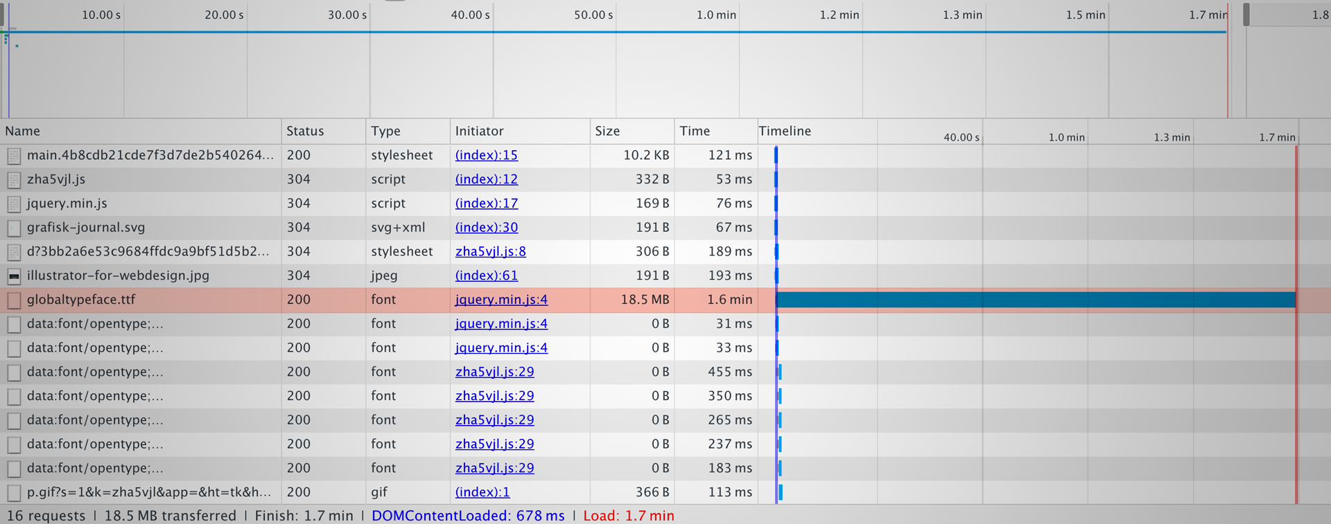
Thankfully, there have cropped up workarounds to this problem provided by font suppliers such as Justfont and Youzuiku. These sites hosts and sends the font files in bite-sized chunks that doesn't choke the user's bandwidth. It works with the magic of a JavaScript snippet that checks for any character that doesn't already sit in the users cache and then requests the missing characters needed to fully render the rest of the page. Like this, the amount of data needed to be downloaded per page more closely resembles a typical image file, which is much more reasonable from the user’s perspective.
The big western font hosting companies have been slow to address this issue, and to make matters worse providers such as Google fonts just isn't available in China because of the great firewall. But fonts.com has been leading the pack and has had great support for subsetting fonts all the way back in 2010 and Monotype has just rolled out a dynamic subset service.
Thankfully, earlier this summer more western providers started to show their support: Adobe's Typekit released a mayor update so that their service now also provide support for subsetting fonts while at the same time adding better support for Asian languages!
As we can see, it is indeed possible to provide web fonts globally today but it still requires massive amounts of research and work. The @font-face property alone just won’t cut it. As it stands today, most of us are forced to rely on paid font suppliers to provide us with their solution; this greatly contradicts the notion of “the open web” as functions like this really should be handled directly in our browser if we care about net equality.
Finally, even with this great technology at our hands it's still recommended to split the font file so that we don't work with a font file that encompasses several languages at once. A single file would be too large to process when most of the characters included aren’t needed for every page or language. Global language support just doesn’t come easy apparently!
Truly Global
If we work with a global company and want take it all one step further we might consider opting for a typeface that has been designed for global usage; this would ensure brand consistency no matter the language. Sadly, there aren't that many typefaces of that kind, Nimbus Sans Global created by URW++ was originally based on Helvetica but has expanded to include support for a wide set of characters. Nimbus Sans and the two other global fonts developed by URW++ are all solid options but they are almost the only options available, and they are quite pricey.

That's why it's refreshing to see that Google and Adobe has joint efforts to release the first open source typeface that aims to support all the world’s languages. The typeface is called Noto Sans or Source Han Sans and its design goal is to achieve visual harmonization across languages. What's refreshing is also that the typefaces are available in several widths which typically isn't the case for typefaces that already features such an extraordinary character support!
And Adobe and Google are not alone, several companies have realized the issue of not being able to provide the same visual appearance regardless of language. Most of them choose to tackle the issue by designing custom typefaces for themselves. Companies such as BMW have chosen to design their own variation of Nimbus Sans Global, and companies such as Sony and Intel have chosen to draw their own custom-tailored global typefaces from scratch.
But more notably: Intel has even made an open source version of their typeface called Clear Sans that is free to use and download.
An open web
Global typography is really hard, but companies have recently started to address the issues. Hopefully we will see greater support in the near future so that information really is equally accessible no matter where you live.